Statistics Normal Distribution

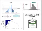
Statistics normal distribution is a description of how data is shaped when plotted on a frequency diagram or a histogram . Normal distribution is the most common shape of data. Above is a histogram of a data set that has normal distribution.

This Data Analysis Video teaches you the basic tools for understanding, summarizing, and making future predictions with your collected data. Includes MS Excel templates.
Statistics Normal Distribution Described
With normal distribution, most of the data is in the center. As you get further away from the average, the less frequent the data appears. I drew a curve on the graph. This curve is called a bell shape curve because it looks like a musical bell. Normal distribution possesses the bell shape curve. Normal distribution will also be called bell shaped data.
The average of the data will be in the center. In some cases you will have perfect normal distribution. In this case the median = mode = mean .
You can use Microsoft Excel to create Histograms.
My First Normal Distribution
The first time I encountered normal distribution was during high school. I remember the teacher telling me that the grades would be based on the curve. I asked myself, what is this curve she speaks of? That curve was the bell shape curve or normal distribution. From my grades perspective, I just didn’t want to be on the beginning side of the curve.
Little did I know at that time, the importance of that curve. That curve represents natural variation. The bell shape curve appears everywhere. In about 90% of all data you collect meets normal distribution. Normal distribution is responsible for about 95% of all applied statistics.
This Data Analysis Video teaches you the basic tools for understanding, summarizing, and making future predictions with your collected data. Includes MS Excel templates.
Statistics Normal Distribution
When you have a Normal Distribution, you can apply statistics and make predictions about the data set. These statistics allows you to describe your data set in terms of averages and standard deviation.
In addition you can apply process control tools such as SPC when you have normal distribution.
Below is a normal distribution curve that is separated by 1, 2, and 3 standard deviations from the center.
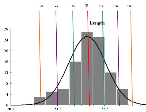
99% of the data occur within +/- 3 standard deviations. You can use the below chart to see the percentage of data with each standard deviation.
If you have specifications you can conduct a process capability study on data sets with normal distribution. Quality Assurance relies on collecting data. That data needs to be studied and understood. Statistical normal distribution lets you do both.
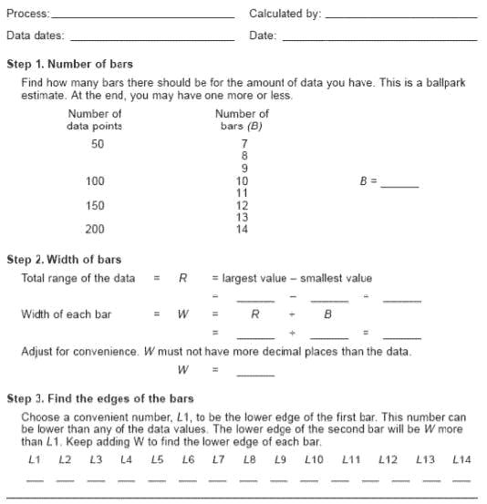
Creating a Histogram
Description:
One of the Total Quality Management Tools is the Histogram.
One uses this graph to show frequency distributions. It looks very much like a bar chart.
When to Use:
This chart graphs data distributions. If you have numerical, variable, continuous data you can use the this chart. The chart organizes and sorts the data. It shows the data in a pictorial format.
Construction :
Collect at least 50 data points from a process.
Use the worksheet below to set up the chart. It helps you determine the number of bars, the width of the bar, and the labels for the bar edges.

After calculating width in step 2 of the worksheet, use your judgment and adjust it to a convenient round number. For example, you might decide to round 0.9 to an even 1.0. The value for W may not have more decimal places than any number in your data set.
Draw x- and y-axes on graph paper. Mark and label the y-axis for counting the data values. Mark and label the x-axis with the L values from the worksheet. The spaces between these numbers will create the bars. Do not allow for spaces between bars.
For each data point, locate it where it fits within the Ls. Mark off one count above the appropriate bar with an X or by shading that portion of the bar.
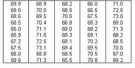
Example
Consider this simple example. Below shows the exam results collected from a training class of 50 individuals:
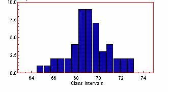
Below is the chart. The center of the data shows about 69. The average is probably near 69. Construct these bar charts to provide a useful picture of your data.
More Info
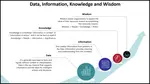
Data and Information
Data and Information, are often used interchangeably, they don’t mean the same thing
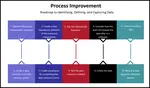
Process Improvement and KPOVs
Lean Sigma is different to many traditional Process Improvement initiatives in its reliance on data to make decisions
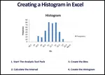
Histogram in Excel
Follow these steps to create a Histogram in Excel. This includes turning on data analysis, creating bins, and sorting data.
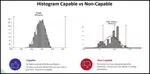
Histogram Examples: A Picture of Your Data
See our histogram examples. We discuss normal distribution and how it applies to quality assurance. Histograms are a key process improvement tool.
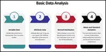
Learn Data Analysis Techniques
When you understand data analysis techniques, you take a big step towards making product and process improvements.

Data Analysis Video
Download Today. Don’t take chances without understanding your data. Data drives business decisions. But how does this work? This introduction to Data Analysis Video shows you how to gather, summarize, and present data to management and your team. $69.00. Satisfaction guaranteed.
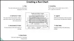
Run Chart
A Run Chart displays the process performance over time. It is a line graph of data points plotted in chronological order. Learn more!
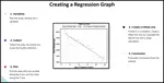
Regression
See our article on regression, includes details, collecting the data, examples, roadmap and possible problems
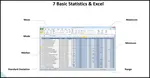
Data analysis in excel
Data analysis in excel discusses calculating averages, ranges, and standard deviation in Microsoft Excel.
Continuous Data
Learn how to evaluate your continuous data and assure satisfactory inspection. Without conducting an MSA on your data set, you put your inspection data at risk.
What is Data Analysis? A Tool for Continuous Improvement
What is data analysis? Understanding data is key to continuous improvement, your quality assurance systems and ISO 9001 certification.
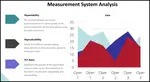
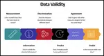
Validity for Measurement Systems
Understand Measurement System Analysis, and we present a road map to apply MSA Validity
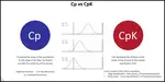
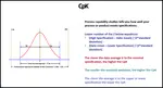
Understand Process Capability
Learn about Process Capability, Process Drift, PpK Vs CpK
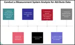
MSA Attribute data
An overview of MSA Attribute data and how MSA data affects your processes
Process Capability Studies
Process capability studies demonstrate the fit of your data to your specifications. Machine process capability determines current and future defects.
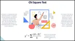
Chi Square
Learn how to apply Chi Square in practice, when to use it , how to insure results


 |
Software, Videos, Manuals, On-Line Certifications | |
 |
450+ Editable Slides with support links | |
 |
Corrective Action Software | |
 |
Plan and Track Training | |
 |
AQL Inspection Software | |
 |
Learn and Train TRIZ |