Pareto Chart

Pareto chart is one of the total quality management tools and usually used during the define stage in six sigma.
Description
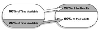
A simple rule, Pareto, 20 % issues causes 80 % results. This means, 80 % if problems come from 20 of reasons. 80 % of results come from 20% of work. 80% of cost come from 20% of spent area...and so on.
When To Use
Use it when there are many problems or opportunities and you want to focus on the most important. Or when your analyzing data about the frequency of problems or causes in a process.

This Data Analysis Video teaches you the basic tools for understanding, summarizing, and making future predictions with your collected data. Includes MS Excel templates.
Constructing A Pareto Chart:
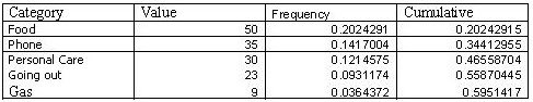
1-Decide the categories to compare. For example, you want to know where you spent your money. You could select these catagories food, gas, telephone, personal care, etc.
2-Determine the appropriate measurement. Common measurements include frequency, quantity, cost and time.
3-Decide the period of time for the chart.
4-In a table, collect the data for each category. For the example, track how much you spent in each category over the week. Calculate the total sum of the money for each category.
5-Arrange the categories in descending way per the total sums.
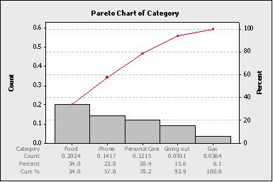
6-Construct and label bars for each category. Place the tallest bar at the far left, then the next tallest to it is right and so on.
7-Calculate the percentage for each category: Percentage is the total for that category divided by the total for all categories times 100. Draw a left vertical axis and label it with frequency.
8-Calculate and draw cumulative percentage: Add the subtotals for the first and second categories percentage. Place a dot above the second bar indicating that sum. To that sum add the subtotal for the third category, and place a dot above the third bar for that new sum. Continue for all bars. Connect the dots, starting at the top of the first bar. The last dot should reach 100 percent on the right scale. Pareto diagram, Pareto analysis
This Data Analysis Video teaches you the basic tools for understanding, summarizing, and making future predictions with your collected data. Includes MS Excel templates.
Analysis Of The Pareto Chart
Examine the first two to three bars. Look at the cumulative sum of the percentages. These will be close to 80%. When addressing issues or root causes, these are the items to focus on. The remaining bars do not contribute significantly. These first couple of bars represent the key 20% of the issues.
After addressing the first two bars, recalculate the pareto chart. This process of solving the first bars and repeating significantly drives improvement.
More Info
Fishbone Template Problems and Downloads
This page discusses how to improve the fishbone template, documents problems with the fishbone diagram template and fishbone charts.
Fish Bone
Learn the steps to create a Fish Bone diagram.
Interrelationship Diagram
Learn the steps to create an interrelationship diagram. Article also provides insight on when to use it too.
Check Points
Review this procedure creating check points, a continuous improvement tool. We include an example of a tally sheet too.
Details on Activity Network Diagram
The what, when, how and why of Activity Network Diagram


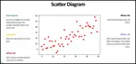
Scatter Diagram
Use a Scatter Diagram to investigate possible relationships. This article provides step by step instructions to creating one
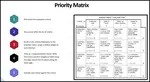
Priorities Matrix
A priorities matrix evaluates and prioritizes a list of options. Learn to formally construct one and analyze the results.
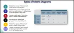
Matrix diagram
Learn the different types of matrix diagram which is a key quality tool.
Balanced Scorecard
The Balanced Scorecard provides a clear prescription as to what companies should measure in order to 'balance' the financial perspective

Customer Lifetime Value The Key
Customer lifetime value the key to understanding how much to invest into customer retention. Download a free spreadsheet for calculating LTV.
Basic Tools for Process Improvement
Do you need a list of basic tools for process improvement? We provides a list of basic, advanced and favorite continuous improvement tools.
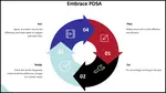
PDCA cycle
Learn the PDCA cycle, when to use it, how to construct it. We include an example of it too.


 |
Software, Videos, Manuals, On-Line Certifications | |
 |
450+ Editable Slides with support links | |
 |
Corrective Action Software | |
 |
Plan and Track Training | |
 |
AQL Inspection Software | |
 |
Learn and Train TRIZ |