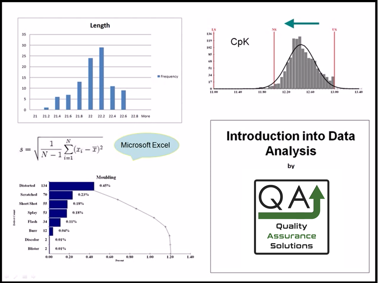
Histogram Examples

These Histogram examples are a graphical picture of data.
The X axis is the measurement. The Y axis is the frequency for that measurement.
Some graphs have a red LS, NS or US.
The LS stands for Lower Specification.
The NS stands for nominal specification (or target).
The US stands for upper specification.
For 100% Quality all data must be between LS and US.

This Data Analysis Video teaches you the basic tools for understanding, summarizing, and making future predictions with your collected data. Includes MS Excel templates.
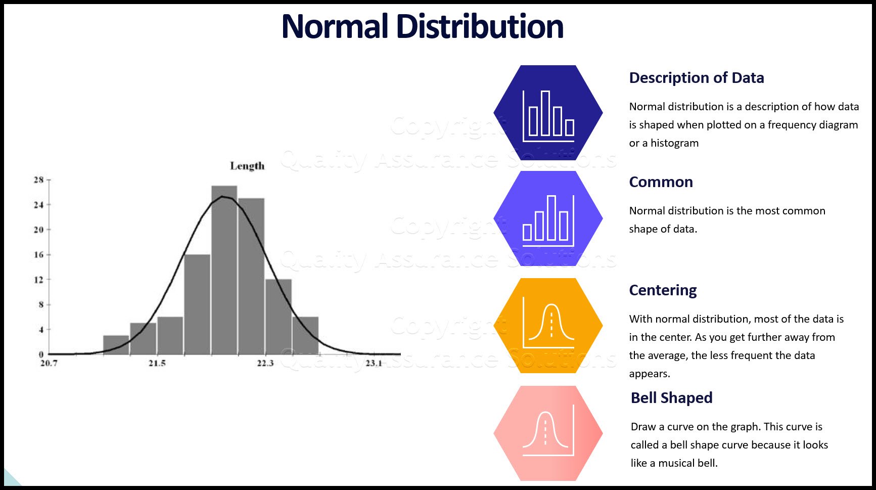
On some graphs, I drew a curve. The curve represents the shape of the data.
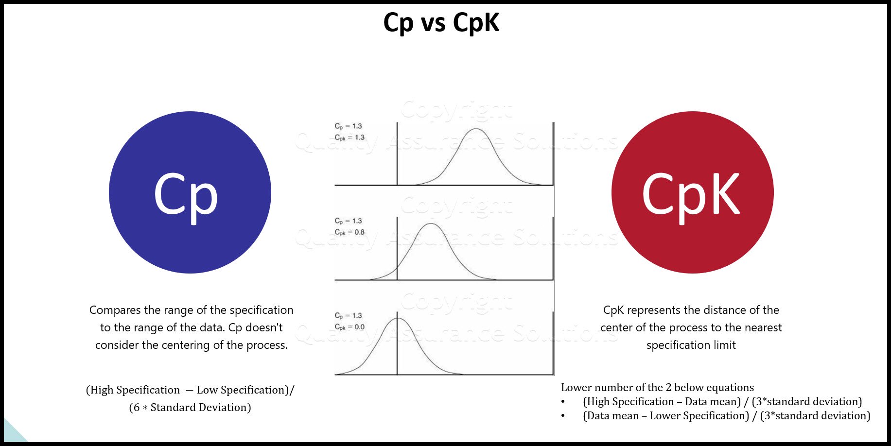
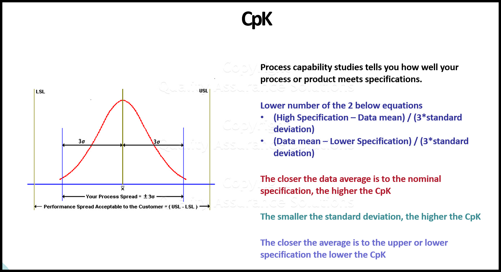
If the curve is bell shape then the data is normally distributed. When the data is normal then we can apply certain statistical methods. This includes concepts such as average, standard deviation, and CpK.
These histograms show how data fits specifications. If the data is bell shaped, we can apply the term CpK. CpK allows us to make a statistical prediction about the data set. CpK predicts how many parts out of a given sample size may be defective.
Most manufacturing processes follow the bell shape curve. Because of this we can apply SPC and other tools to control the process.
Histogram Example: Good Data
Graph A:
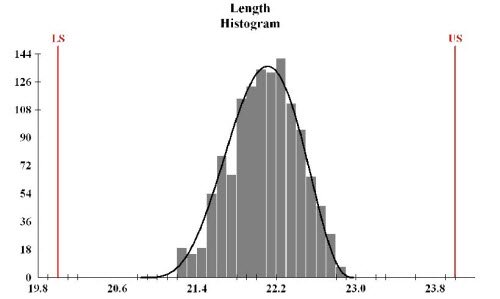
Graph A data is normally distributed.
Graph A data is a bell shaped curve.
The data is centered within the specifications
The mean, mode and median look to be very close to each other.

Learn SPC in an hour. Train your employees. Improve your processes and products. Prevent defects and save your company money.
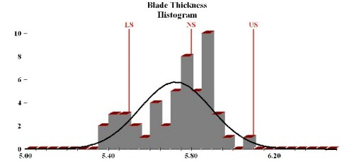
Histogram Examples - Poor Data
Graph B:
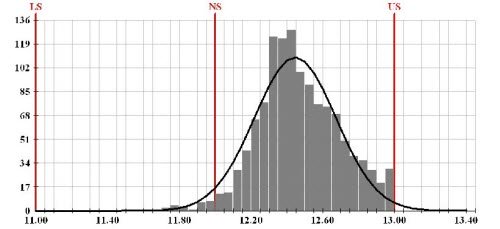
Graph B data is normally distributed.
The data is not centered between the specifications.
If we sampled more parts there is a good chance that parts would fall above the upper specification (US).
If we manufactured this product we would want to adjust the product so most data is closer to the nominal specification.
Graph C:
Graph C is not normally distributed most of the data is to the left of the graph.
The average, mode and median are not close to each other.

8D Manager Software with 8D, 9D, 5Y and 4M report generator. Your corrective action software for managing, measuring, and reporting issues.
Graph D:
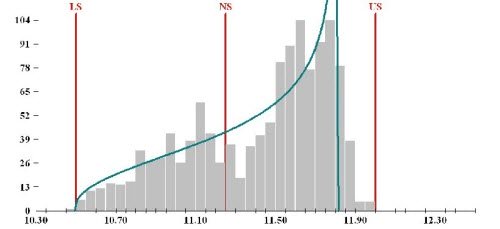
In this Histogram examples, graph D does not have a bell shaped curve.
It is not normally distributed.
Most of the data falls within the specification. Yet most is close to the upper specification.
It looks like the manufacturing process limits the data from going above the upper specification. But the process allowed data to go below the lower specification. The process is not capable of meeting the specifications.
This Data Analysis Video teaches you the basic tools for understanding, summarizing, and making future predictions with your collected data. Includes MS Excel templates.
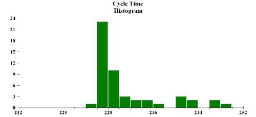
Graph E:
Graph E has an unusual bell curve.
The process has many data points below the specification.
The process is not capable of meeting specifications.
Graph F:
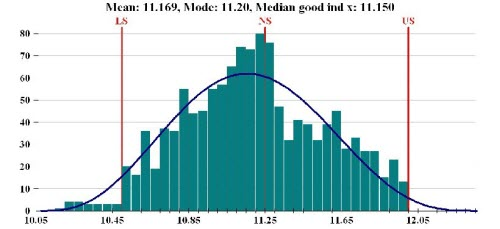
Graph F represents a normal distribution.
Notice how the mean, median, and mode are all relatively close to each other.
However, there is data that is out of specification.
PDCA Complete is an organizational task management system with built-in continuous improvement tools. Includes projects, meetings, audits and more.
Built by Quality Assurance Solutions.
Histogram: Good Data
Graph G:
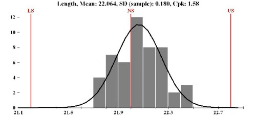
Graph G has a bell shape curve and is normally distributed.
It has a CpK value of 1.5. All of the data from the process will meet specification
More Info
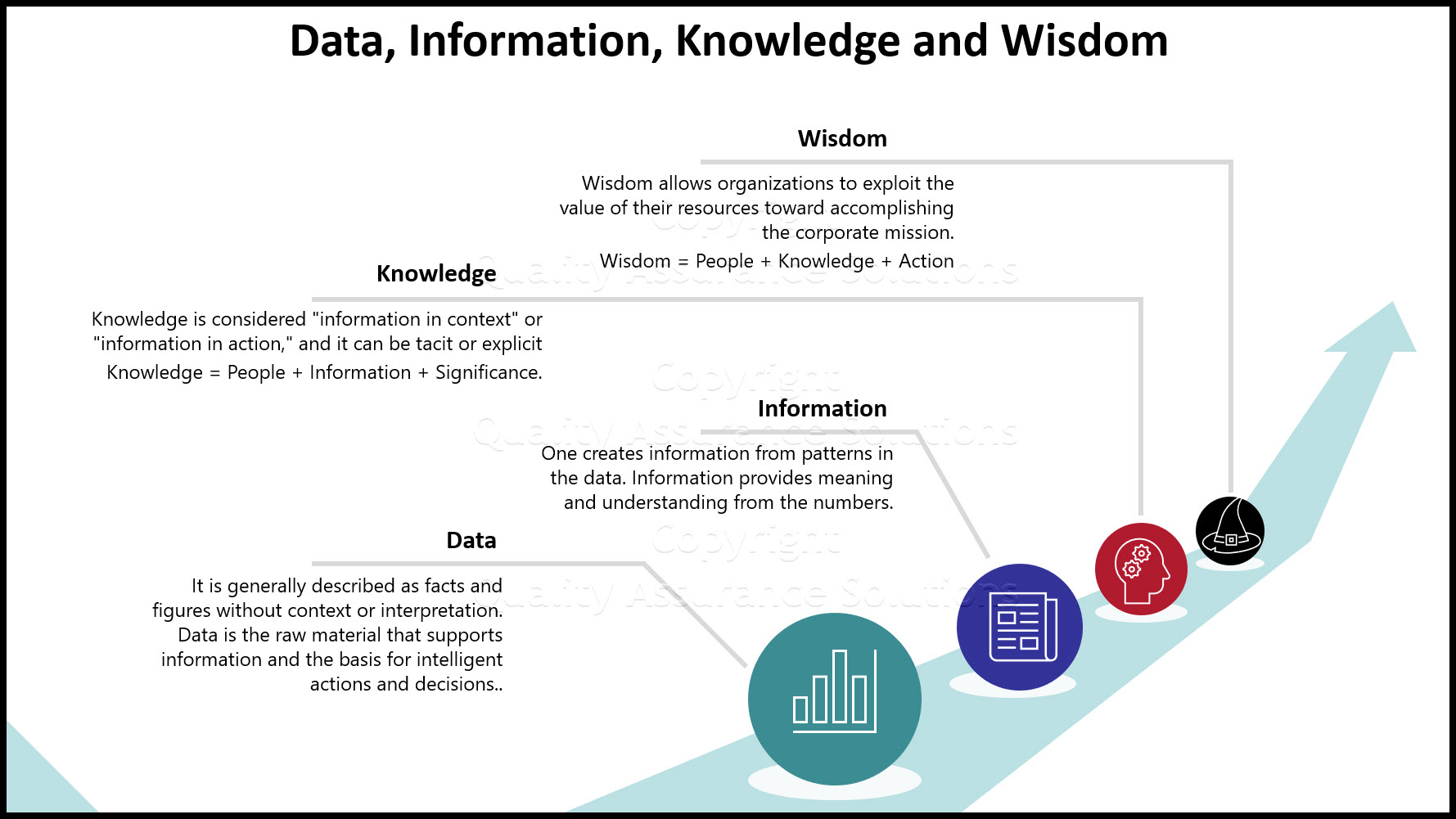
Data and Information
Data and Information, are often used interchangeably, they don’t mean the same thing
Process Improvement and KPOVs
Lean Sigma is different to many traditional Process Improvement initiatives in its reliance on data to make decisions
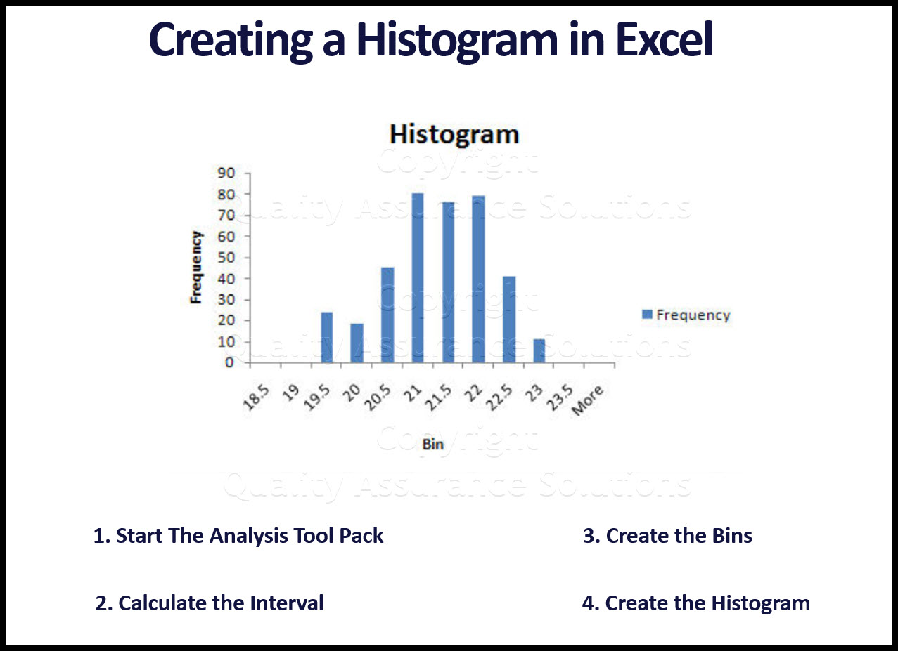
Histogram in Excel
Follow these steps to create a Histogram in Excel. This includes turning on data analysis, creating bins, and sorting data.
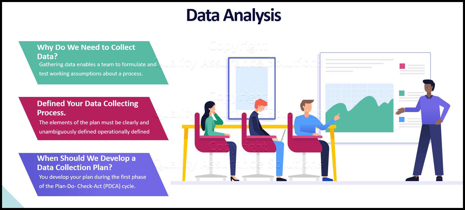
Learn Data Analysis Techniques
When you understand data analysis techniques, you take a big step towards making product and process improvements.
Data Analysis Video
Download Today. Don’t take chances without understanding your data. Data drives business decisions. But how does this work? This introduction to Data Analysis Video shows you how to gather, summarize, and present data to management and your team. $69.00. Satisfaction guaranteed.
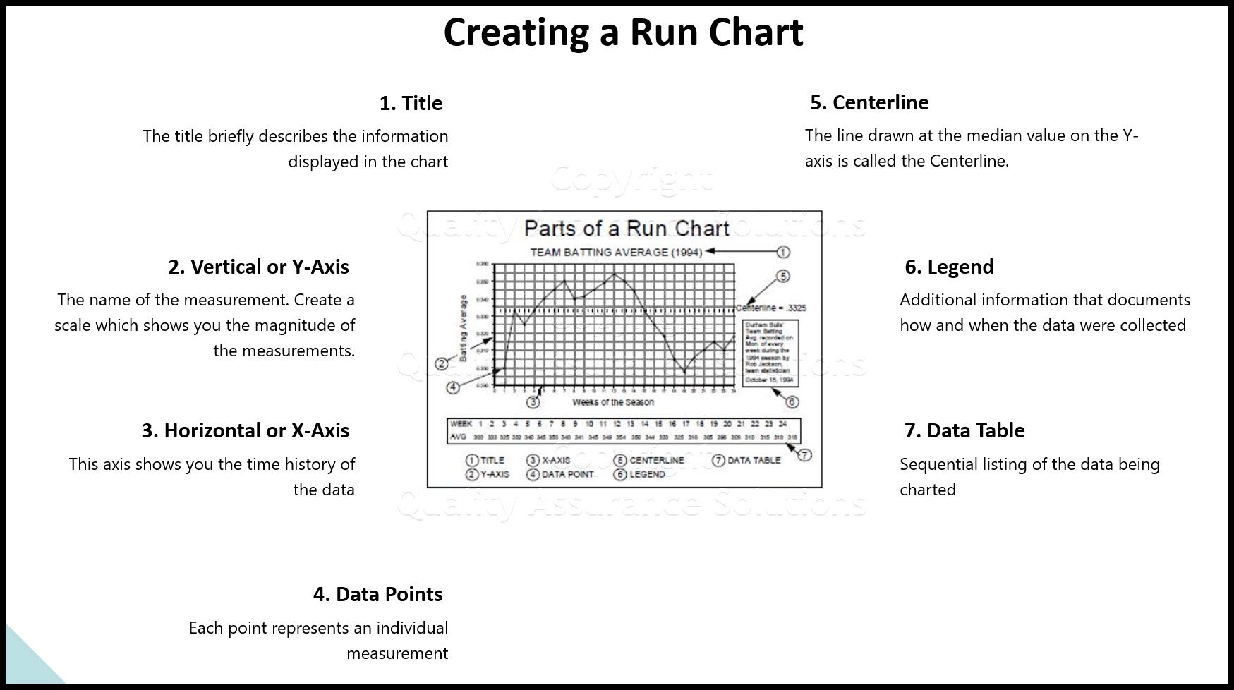
Run Chart
A Run Chart displays the process performance over time. It is a line graph of data points plotted in chronological order. Learn more!
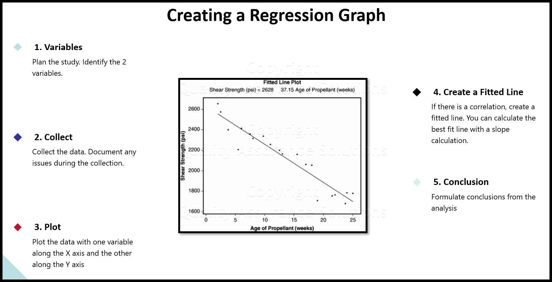
Regression
See our article on regression, includes details, collecting the data, examples, roadmap and possible problems
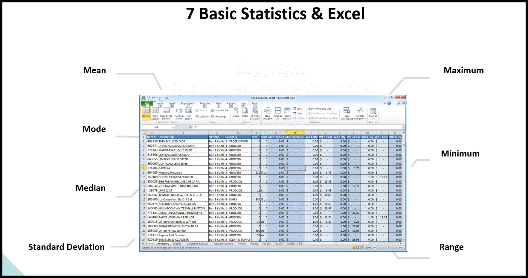
Data analysis in excel
Data analysis in excel discusses calculating averages, ranges, and standard deviation in Microsoft Excel.
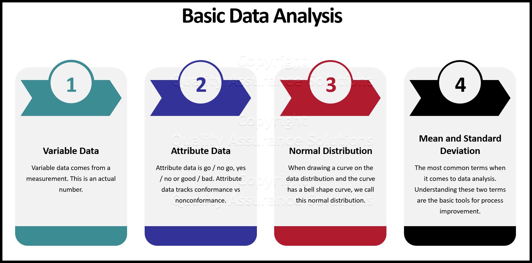
Continuous Data
Learn how to evaluate your continuous data and assure satisfactory inspection. Without conducting an MSA on your data set, you put your inspection data at risk.
What is Data Analysis? A Tool for Continuous Improvement
What is data analysis? Understanding data is key to continuous improvement, your quality assurance systems and ISO 9001 certification.
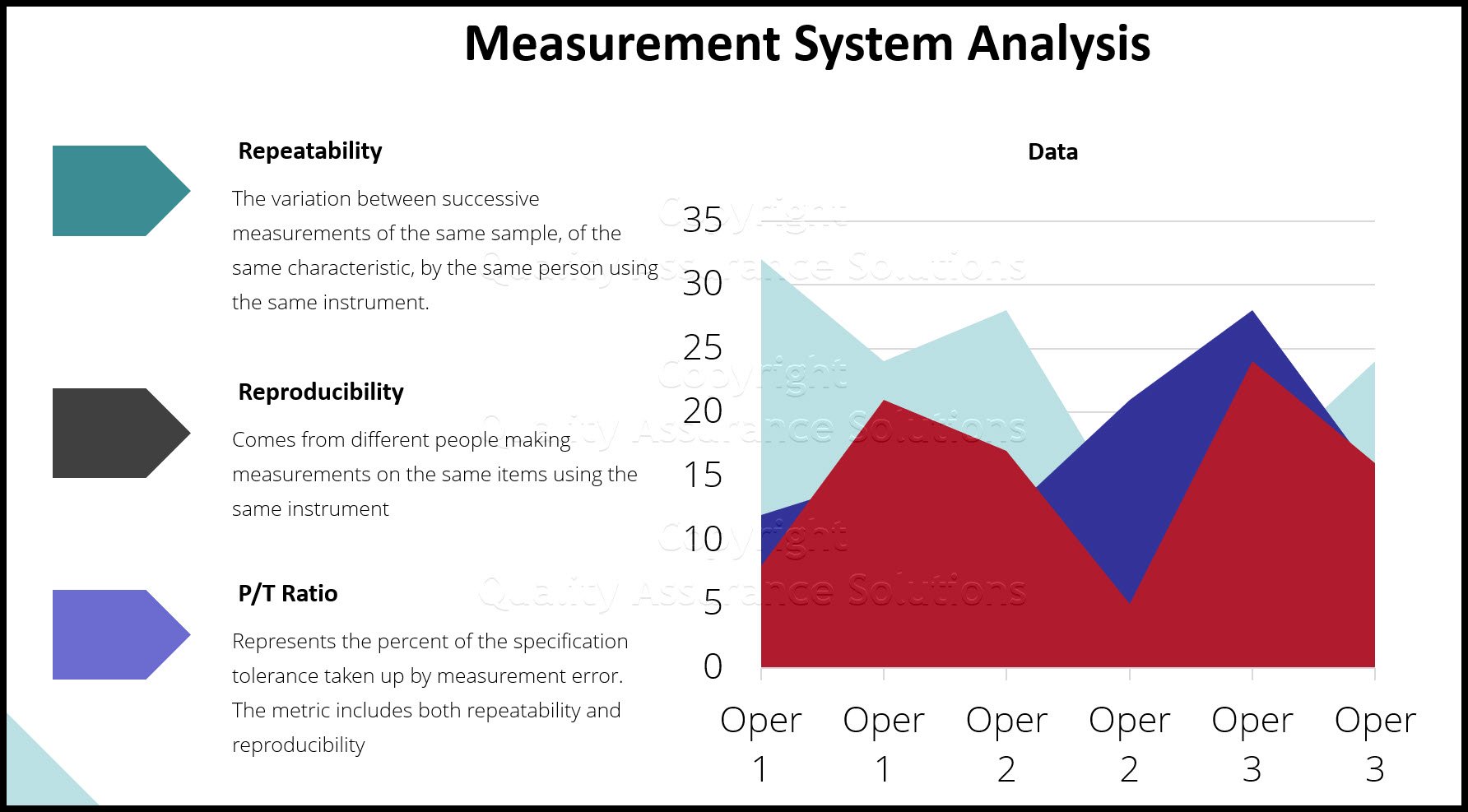
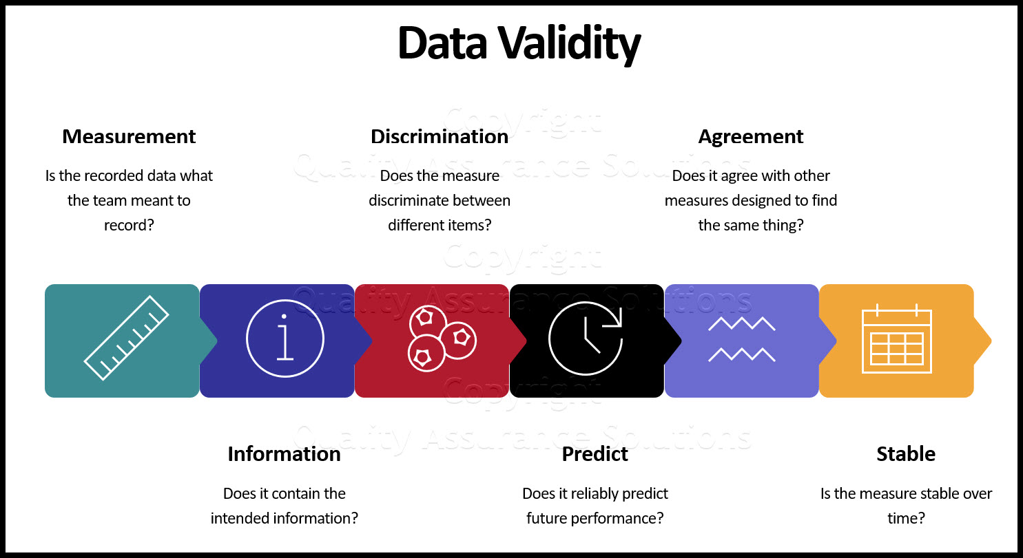
Validity for Measurement Systems
Understand Measurement System Analysis, and we present a road map to apply MSA Validity
Statistics Normal Distribution Described
Do you know the statistics normal distribution? Normal distrubution is critical to know for your quality assurance program.
Understand Process Capability
Learn about Process Capability, Process Drift, PpK Vs CpK
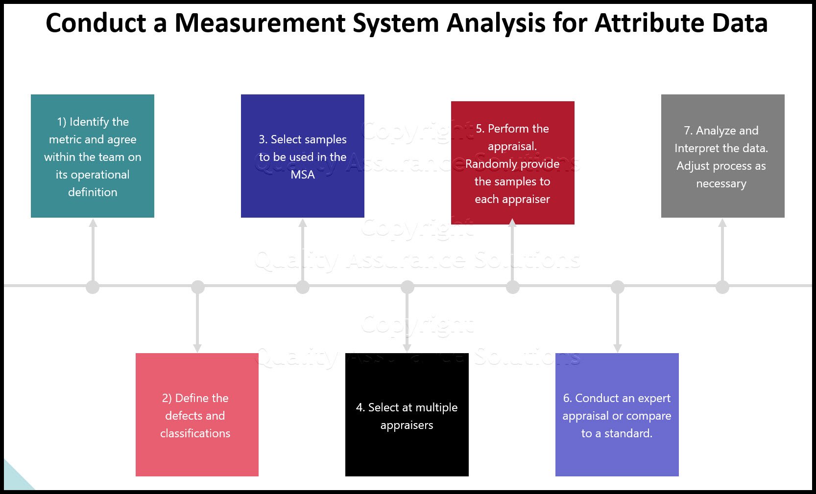
MSA Attribute data
An overview of MSA Attribute data and how MSA data affects your processes
Process Capability Studies
Process capability studies demonstrate the fit of your data to your specifications. Machine process capability determines current and future defects.
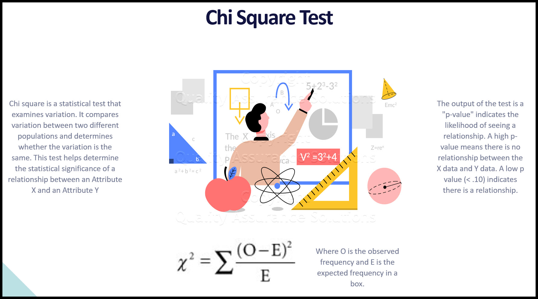
Chi Square
Learn how to apply Chi Square in practice, when to use it , how to insure results
- QAS Home
- Histogram
|
Quality Assurance Solutions Robert Broughton (805) 419-3344 USA |
 |


 |
Software, Videos, Manuals, On-Line Certifications | |
|
|
An Organizational Task Management System. Projects, Meetings, Audits & more | |
|
|
Corrective Action Software | |
 |
Plan and Track Training | |
 |
AQL Inspection Software |
 |
450+ Editable Slides with support links | |
 |
Learn and Train TRIZ | |
 |
Editable Template | |
 |
Templates, Guides, QA Manual, Audit Checklists | |
 |
EMS Manual, Procedures, Forms, Examples, Audits, Videos | |
 |
On-Line Accredited Certifications Six Sigma, Risk Management, SCRUM | |
|
|
Software, Videos, Manuals, On-Line Certifications |