Creating a Histogram in Excel

Here are instructions for making a histogram in Excel. An excel histogram is not the easiest function in Excel. I don't know why Microsoft made it difficult. Histograms are extremely useful in quality assurance as they create a picture of your data.

This Data Analysis Video teaches you the basic tools for understanding, summarizing, and making future predictions with your collected data. Includes MS Excel templates.
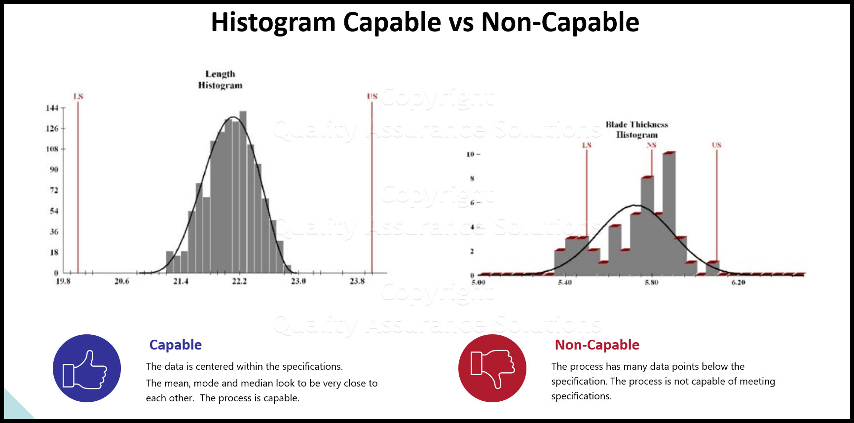
Histograms are necessary for continuous improvement measurements. They show your data distrubution before and after the improvement.
Histograms provide one method to document your continuous improvement efforts.
Before creating a histogram, be sure to read this discussion on data analysis.
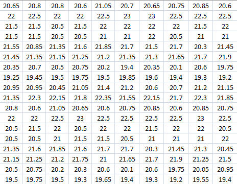
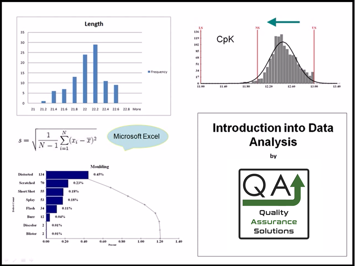
Below is partial of the data set that I'm using for the histogram.
In the discussion below, we use MS Exel Office 365 version. Earlier versions can also be used.
Before you make a histogram, you must load the analysis tool pack.
The Analysis Tool Pack.
Open Excel
Click the file tab (top left)
Click Excel options
Click Add-ins
Click Go…
Check Mark Analysis ToolPack
Click OK
Excel will now install the tool pack.
Calculate the Interval
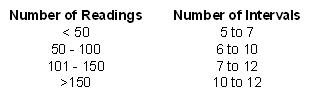
To create a histogram, first figure out the interval. See below for the recommended interval. The interval is the number of columns of data that you want for the histogram.
Take the range and divide by your selected interval. Round that number to a number that is easy to work with. For example if you calculated an interval of 1.4234 use 1.5.
For my data set, I chose .5 as the interval.
This Data Analysis Video teaches you the basic tools for understanding, summarizing, and making future predictions with your collected data. Includes MS Excel templates.
Create the Bins
In a blank work space in excel, record your intervals from low to high. You can start with the minimum or below the minimum of your data set.
In my case I start with 18.5 which is just below the minimum of the data set.
Add you interval to minimum and then to each adjacent cell. So my cells read 18.5, 19, 19,5, 20....23.5.
This creates the Bins.
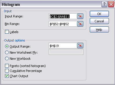
Create the Histogram in Excel
Select an empty cell where there are no filled in cells around it.
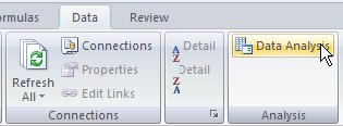
Click Data Menu
Click Data Analysis on the Analysis tab
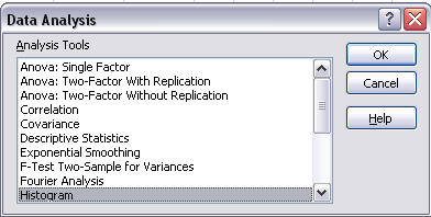
Select Histogram
Input Range – Select your entire data set
Bin Range – Select the cells that created your bins.
Output Range - Select a cell where you want the data chart to go. Be sure there is no other data surrounding this spot as Excel may want to overwrite that data.
Check Mark the Chart Output
Click Ok
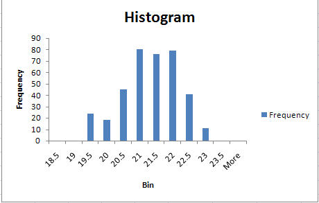
Here is the histogram in excel:
This Data Analysis Video teaches you the basic tools for understanding, summarizing, and making future predictions with your collected data. Includes MS Excel templates.
More Info
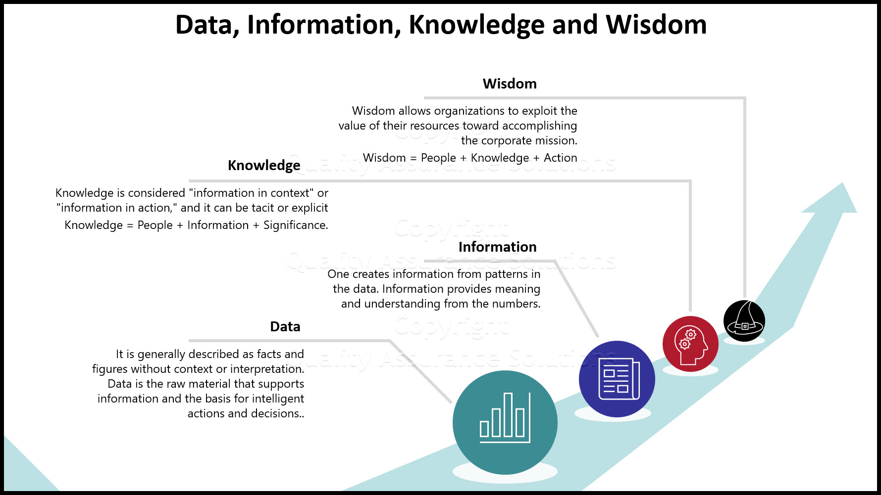
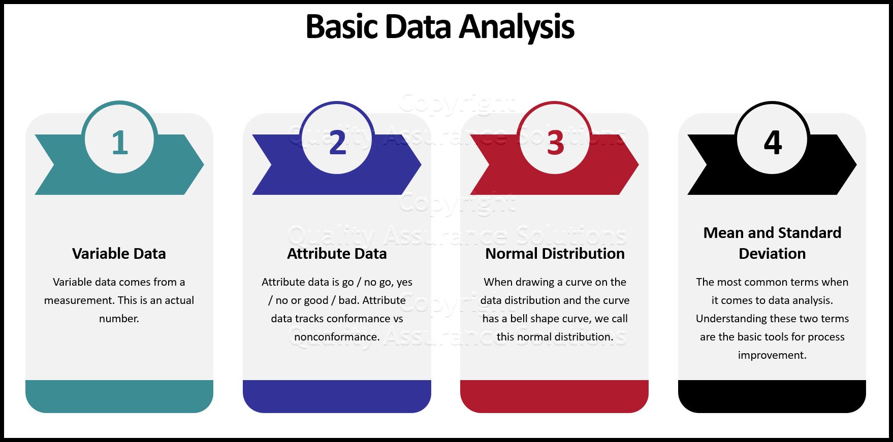
Data and Information
Data and Information, are often used interchangeably, they don’t mean the same thing
Process Improvement and KPOVs
Lean Sigma is different to many traditional Process Improvement initiatives in its reliance on data to make decisions
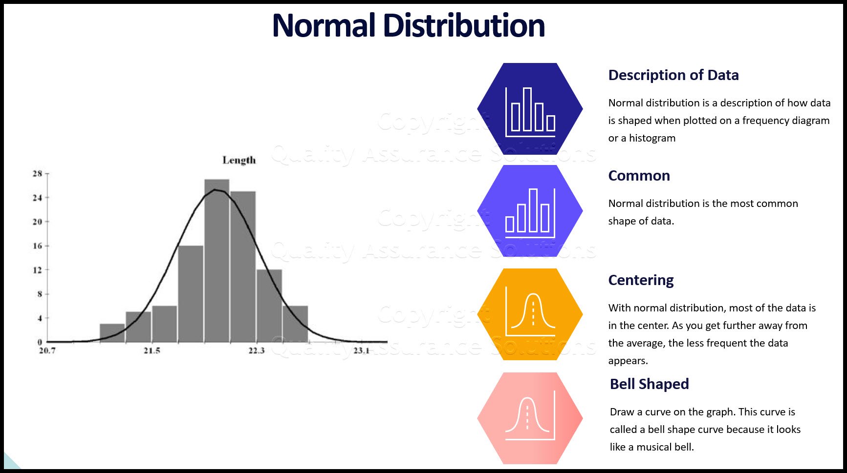
Histogram Examples: A Picture of Your Data
See our histogram examples. We discuss normal distribution and how it applies to quality assurance. Histograms are a key process improvement tool.
Learn Data Analysis Techniques
When you understand data analysis techniques, you take a big step towards making product and process improvements.

Data Analysis Video
Download Today. Don’t take chances without understanding your data. Data drives business decisions. But how does this work? This introduction to Data Analysis Video shows you how to gather, summarize, and present data to management and your team. $69.00. Satisfaction guaranteed.
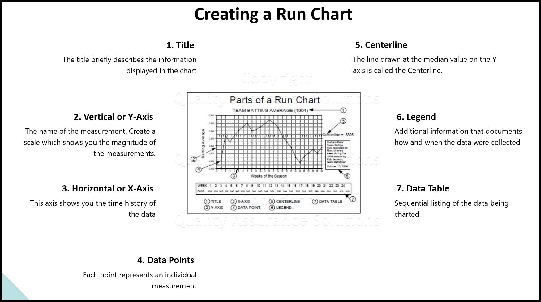
Run Chart
A Run Chart displays the process performance over time. It is a line graph of data points plotted in chronological order. Learn more!
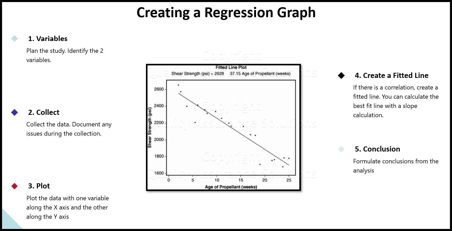
Regression
See our article on regression, includes details, collecting the data, examples, roadmap and possible problems
Data analysis in excel
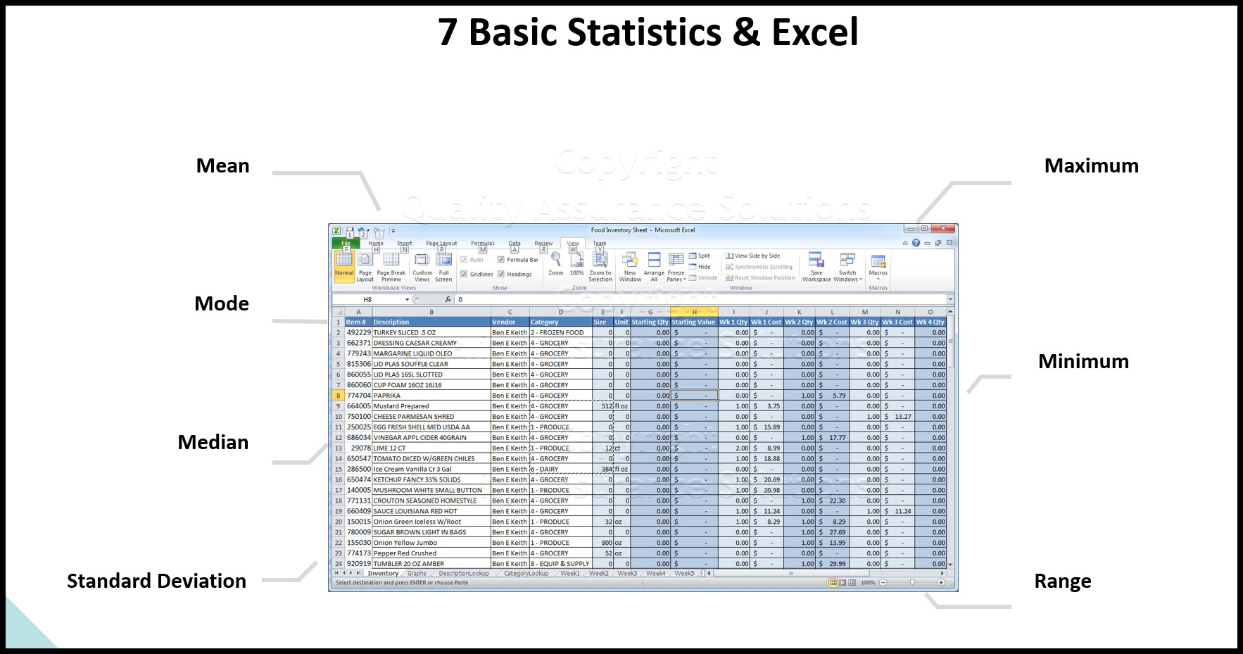
Data analysis in excel discusses calculating averages, ranges, and standard deviation in Microsoft Excel.
Continuous Data
Learn how to evaluate your continuous data and assure satisfactory inspection. Without conducting an MSA on your data set, you put your inspection data at risk.
What is Data Analysis? A Tool for Continuous Improvement
What is data analysis? Understanding data is key to continuous improvement, your quality assurance systems and ISO 9001 certification.
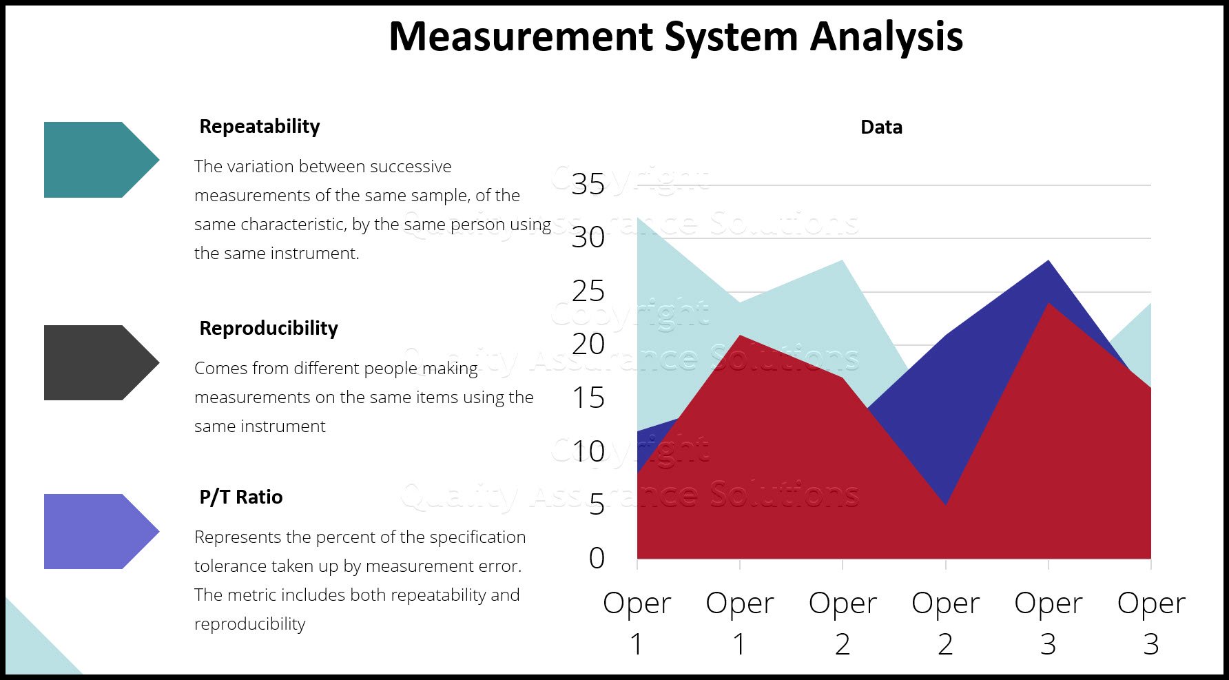
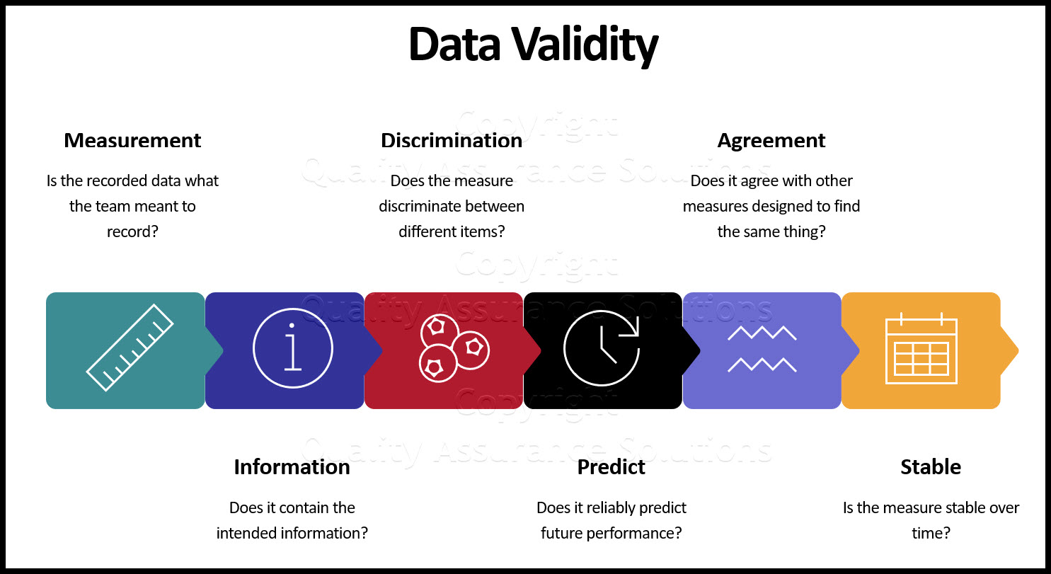
Validity for Measurement Systems
Understand Measurement System Analysis, and we present a road map to apply MSA Validity
Statistics Normal Distribution Described
Do you know the statistics normal distribution? Normal distrubution is critical to know for your quality assurance program.
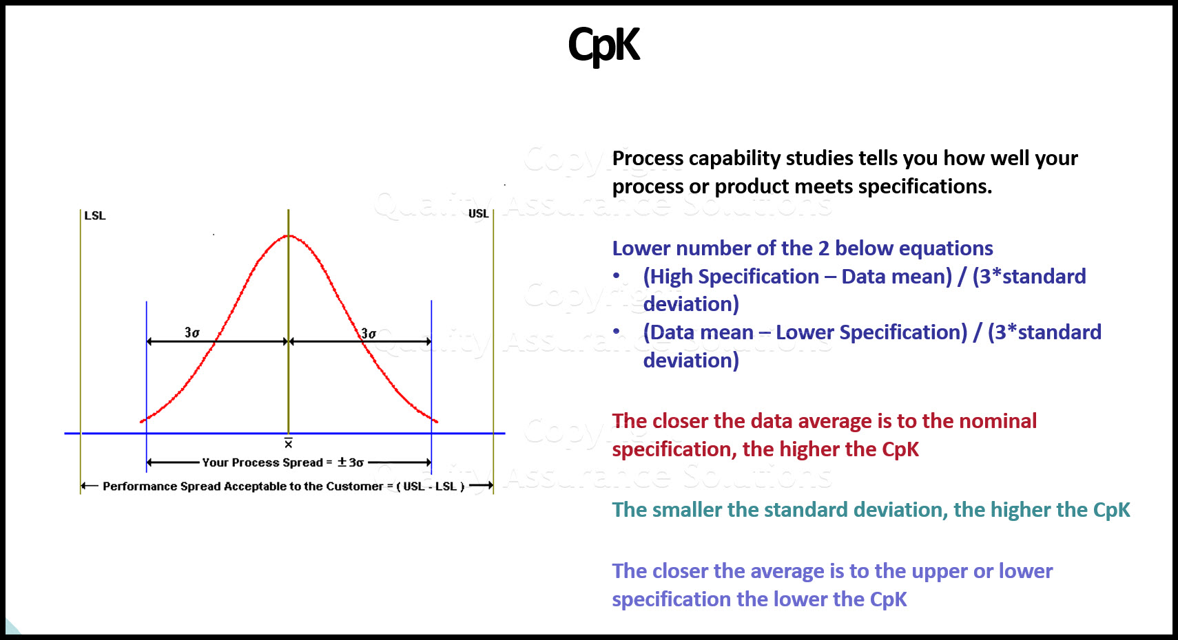
Understand Process Capability
Learn about Process Capability, Process Drift, PpK Vs CpK
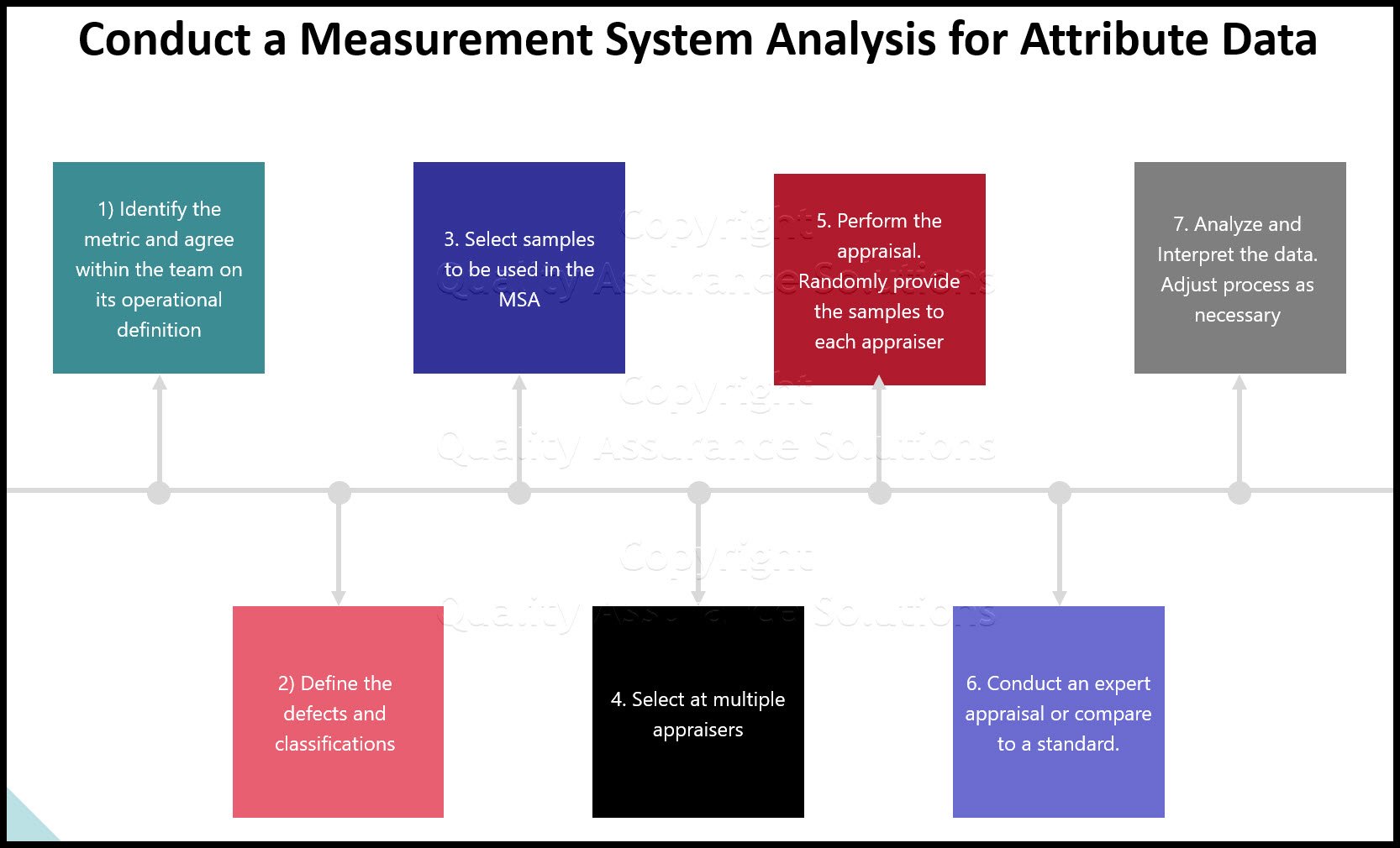
MSA Attribute data
An overview of MSA Attribute data and how MSA data affects your processes
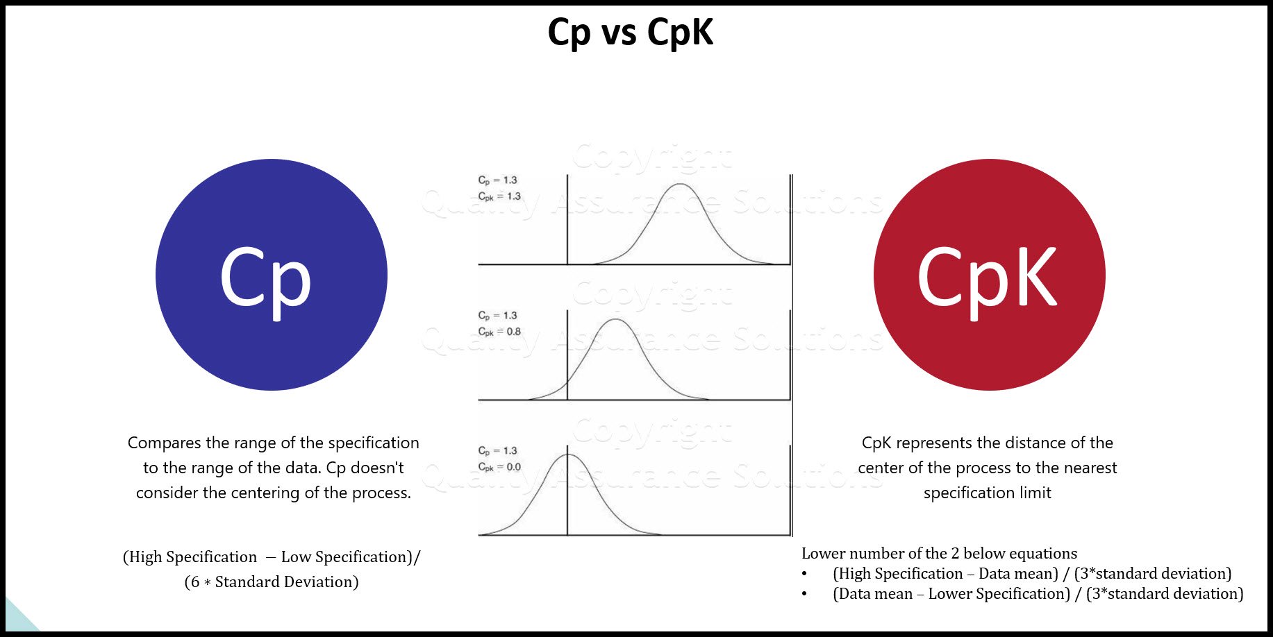
Process Capability Studies
Process capability studies demonstrate the fit of your data to your specifications. Machine process capability determines current and future defects.
Chi Square
Learn how to apply Chi Square in practice, when to use it , how to insure results

- QAS Home
- Data Analysis
- Creating a Histogram in Excel
|
Quality Assurance Solutions Robert Broughton (805) 419-3344 USA |
 |


 |
Software, Videos, Manuals, On-Line Certifications | |
|
|
An Organizational Task Management System. Projects, Meetings, Audits & more | |
 |
Corrective Action Software | |
 |
Plan and Track Training | |
 |
AQL Inspection Software |
 |
450+ Editable Slides with support links | |
 |
Learn and Train TRIZ | |
 |
Editable Template | |
 |
Templates, Guides, QA Manual, Audit Checklists | |
 |
EMS Manual, Procedures, Forms, Examples, Audits, Videos | |
 |
On-Line Accredited Certifications Six Sigma, Risk Management, SCRUM | |
|
|
Software, Videos, Manuals, On-Line Certifications |